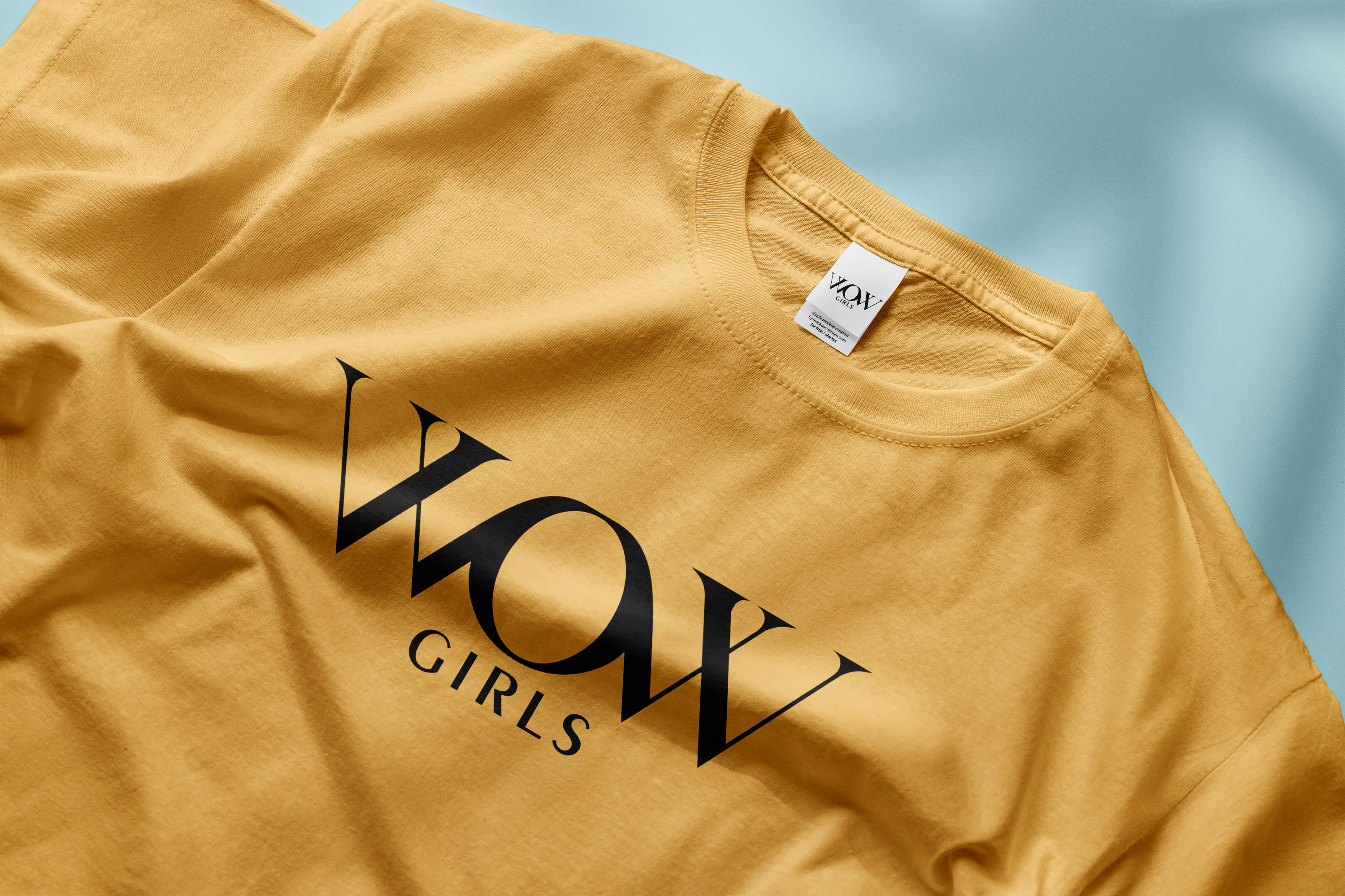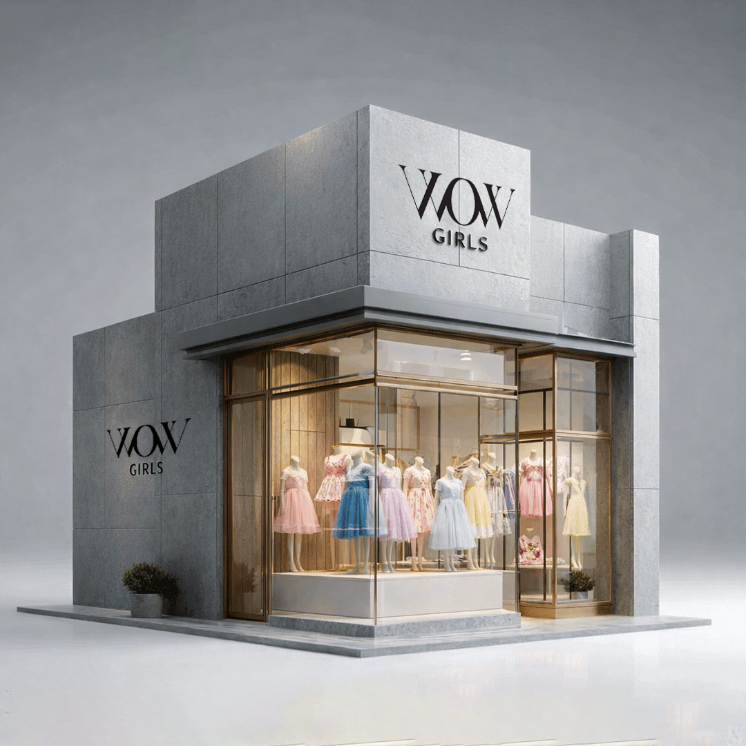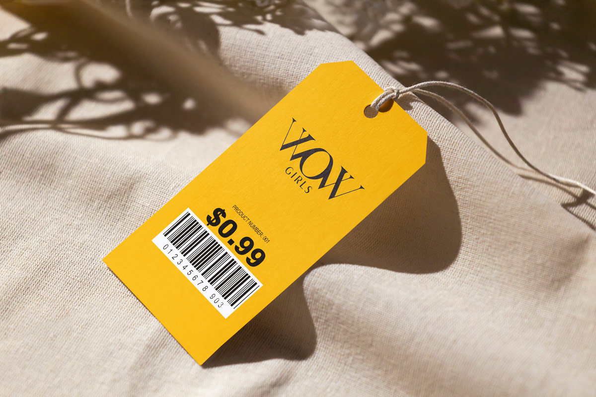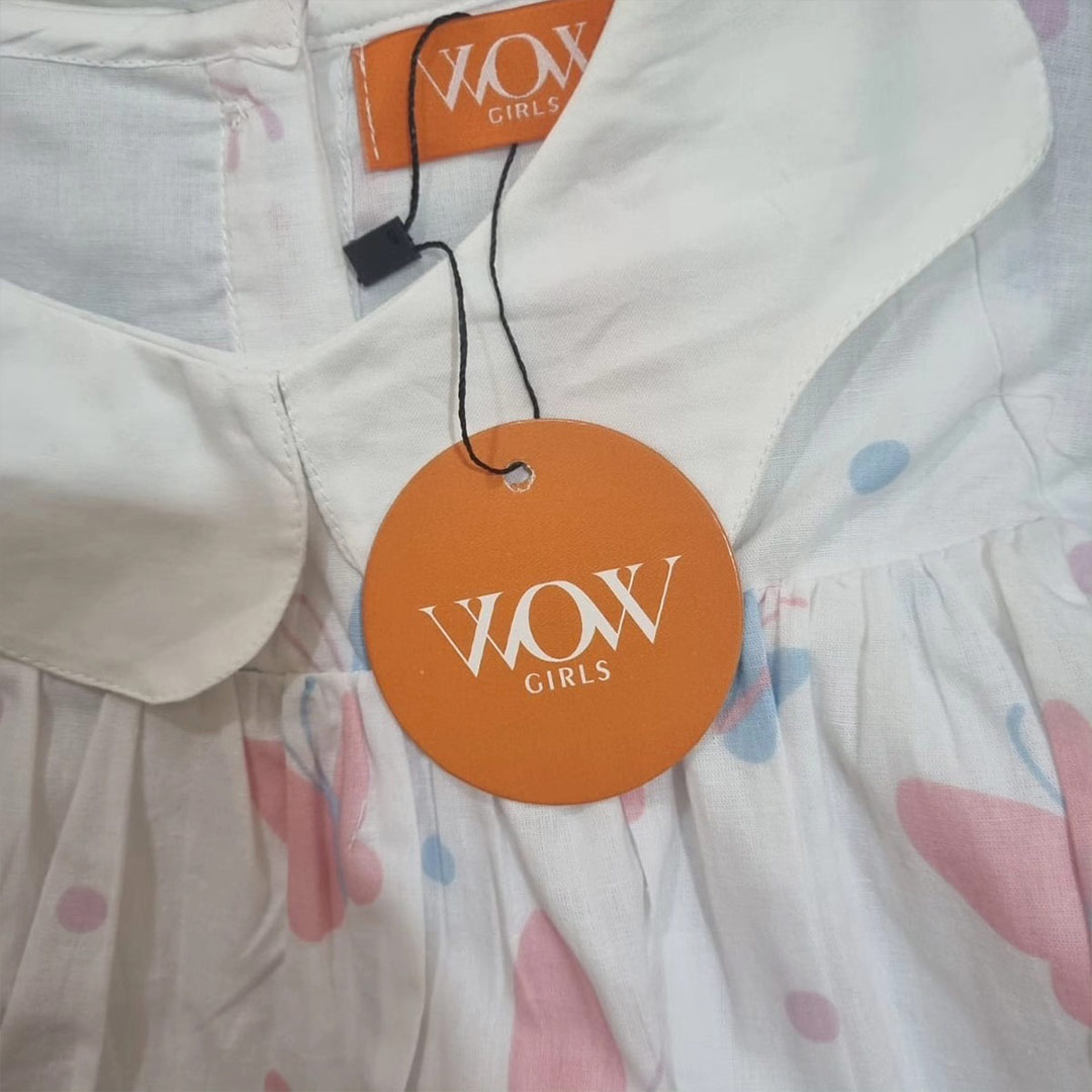

WOW GIRLS is a clothing brand exclusively designed for girls under 8 years old. The brand vision was to create fashionable, comfortable, and joyful apparel that reflects innocence, confidence, and playful elegance.
- Instantly communicate that the brand is for young girls.
- Feel premium yet playful.
- Be minimal and timeless.
- Work seamlessly across clothing tags, packaging, social media, and store branding.
The Design Challenge
Designing for a children’s clothing brand often leads to predictable solutions like bright colors, cartoon elements, or overly decorative typography. The challenge here was different: create a sophisticated, premium logo avoiding cliché childlike graphics, making the design meaningful rather than decorative, and ensuring the mark feels scalable and iconic. The biggest challenge was integrating femininity and childhood essence without using obvious symbols like bows, stars, or cartoon illustrations.
The Concept Idea
The breakthrough came from the brand name itself: WOW. The word WOW is symmetrical, expressive, emotionally powerful, and universally understood. We decided to transform the typography into a visual story.
Logo Construction Strategy
The core idea was to connect the left W and the right W, merge them through the center O, and transform the O into a subtle baby girl head silhouette. By connecting both W letters to the O, the logo becomes structurally unified, the center O transforms into the 'face' of a baby girl, and the overall shape subtly resembles a child’s head framed by hair or bows. This creates a hidden visual meaning—the brand name itself forms the identity of the girl. No extra graphics. No additional symbols. Just intelligent typography.
Symbolism & Meaning
Problem
Integrating meaning into typography.
Solution
W-O-W Structure: Symmetry represents balance, innocence, and harmony. Connected Letters: Emotional connection, protection, and care. O as Baby Girl: The brand revolves around little girls. Minimal Serif Typography: Premium, stylish, and fashion-forward positioning.
Results
The logo subtly communicates: 'Every girl is the center of WOW.'
Typography Direction
We selected a refined serif style to elevate the brand beyond typical kidswear, position WOW GIRLS as a premium fashion label, and make it adaptable for luxury-style branding. The spacing and proportions were carefully adjusted so the O feels centered and dominant, the W letters support the central form, and the silhouette illusion remains clean and elegant.
Why This Logo Works
Memorability: The hidden baby girl silhouette makes it distinctive. Simplicity: Clean structure ensures strong recall and scalability. Versatility: Works beautifully in clothing labels, embroidery, packaging, social media, and store signage. Emotional Connect: Parents instantly recognize that the brand is centered around little girls.
Conclusion: The WOW GIRLS logo is not just a name, it is a visual story. By intelligently connecting the W letters and shaping the O into a baby girl silhouette, we created a mark that is concept-driven, emotionally resonant, strategically positioned, and visually elegant. A simple word. A hidden story. A strong brand identity.